Monday, August 27, 2012

Designing Environments That Feel Right - Part 2: The Art Tests

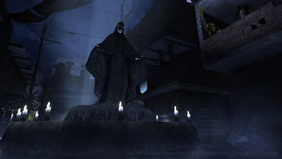
Favela Courtyard in a rare night appearance

Previously, I talked about the cornerstones of game art pre-production; reference imagery and concept art. This week we move forward into 3D Design and realizing these ideas in actual game art.

Early in the development of FEAR 3, the art team was up against some significant challenges. Our engine was previously designed to service large scale outdoor games like Fracture and MechAssault. So we had to essentially retool "level design" to accomodate the relatively smaller-scale worlds we had in mind for our FPS. 

Our first foray into 3D involved creating an "Art Test". By definition, an Art Test (sometimes also referred to as a beautiful corner) is designed to be a small snippet of a full 3d Environment. It demonstrates to the team and the publisher that that we have both the vision and the process to build the world art required to support 6-8 hours of single-player (and later co-op) campaign.

Now, in a perfect world, you would start this process with a very small team of skilled artists. That way, you can prove your concept with less risk and drain on resources. In our case, we had about 7 or 8 3D environment artists in two locations, plus myself focusing on the Art Test. With that many people, you go wide and try to cover a lot of territory quickly to help offset the burn rate of a larger team in pre-production.

We gave ourselves roughly a 60-day period to prototype two small Favela-style locations. And with the number of staff available, we were able to deliver playable prototypes that were fully set-dressed, at what we believed was alpha visual quality.*

*Note: Many many trials and lessons later we learned what "alpha visual quality" means in the real world. Stay tuned for more on this.

Level Art Beginnings

To start, we ran through some initial meetings with the Design team in order to understand more about the game play goals, story elements, and what role the environments would play. This was an important step, even though we weren't building a "real" level yet. Similar meetings with Engineering would cover engine metrics, art tools, and pipeline, helping give us a better understanding of our capabilities and limitations.

Then the Environment artists split into two mini-teams. Building on the great concept art and substantial reference imagery we assembled, one team focused on building the Favela Courtyard concept, and the other team started work on the Favela Alley concept. 

For the artists, this is probably one of the most fun times on a project, because it's a true visual exploration and discovery of potential. The Art Test isn't encumbered by all the other factors that go into making a real game level, it's a unique expression of realtime 3D artwork. 

Team Breakdown

Although there was always crossover, artists on the team were assigned roughly as follows:

Art Lead - manages the main World file and the placement of assets within, as well as integrating art created by the staff. This person is the gatekeeper of quality, consistency, and performance.

Hard Surface Modelers - a majority of the team, they build all the structures, objects, and props needed for the level. Often they would create the textures and build the necessary shaders.

Lighter - performs all duties required to light the world. This was usually myself in most of the early-to-mid FEAR 3 project work. 

The Art Test is kind of like building a film set of your ideal game presentation. However, all assets must be built at realistic game resolutions. Our goal was to load and run comfortably on the XBox 360, so that one could closely inspect and interact with the world elements.

We combed through the concept & reference, producing lists of assets we wanted to make. Typically we'd categorize assets as "must-haves", "should-haves", and "nice-to-haves". This prioritization gave us a route to trim the lists without severely impacting the results (in case schedule became tight).


Results of the Art Tests

So here's what we came up with. The Chicago team at Day 1 Studios (led by Murray Kraft) built the Courtyard. We decided to represent the space as a more open, dense urban Favela with a late afternoon sun and hot, dusty, polluted air. 

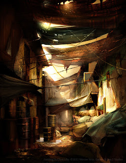
The Hunt Valley team at Day 1 Studios (led by Damien Bull) built the Alley. For that we wanted a more claustrophobic, close-quarters feeling with a mid-day sun and cooler color palette.

Here is some video captured from the Xbox 360 build:


And a few still images (wish I could have found more!):


Favela Courtyard Art Test

Favela Alley Art Test

As you can see we didn't try to build exactly 1:1 with the concept art. That sometimes can be cool, but in games it's often better to use concept art as a visual foundation. Not everything succesfully transferred from the concept art (mostly the richer, more saturated colors). But this was by design, as later we would need the characters to really pop in front of the backgrounds.

It's worth noting that none of what I am showing would have been possible without the hard work of many people on the FEAR 3 team at Day 1 Studios. It takes an incredibly dedicated team of artists, designers, programmers, and production staff to make a project like this come together.

Our first attempt at scaling up

Naturally a huge environment of complex worlds can’t be built entirely from unique assets. Re-use, modularity, and tiling are all methods that extend game content while making production feasible within narrow time frames.

Favela is a challenging subject to systemize, given the chaotic and organic layout of the spaces. So in our first run at systemizing the environment, we broke the structures into separate interiors & exteriors, and tried to craft a lego-style system to piece it all together. Separately, we experimented with shaders that would take a base set of textures and produce lots of variation for little memory cost.

Favela shacks are relatively simple architecture, a haphazard stack of boxes is a reasonably good metaphor for how these neighborhoods were constructed. We started with looking at interiors & exteriors as separate entities.

1) A single but complex material for exterior and interior surfaces
2) Variants would be created for 1st, 2nd, and subsequent stories of a structure
3) Consistent UV scale that wraps perfectly around edges
4) Collision modeled at this level


Some simple interior & exterior structural pieces that fit together

Then we created the "uber" material, one that would provide a rich surface with plenty of variation.

1) Use Vertex alpha for blending layers (rough vs. cracked/degraded)
2) Use Vertex color for edge grime
3) One material and with an atlas texture at around 24 shader instructions


Vertex alpha blends between textures, vertex color adds explicit interest

This approach gave us reasonably rich base surfaces which improved with geometric degradation applied. We could then layer on decal treatments to provide local detail. Structures would be built from a set of tiles that could mix & match exterior, interior, and multiple floors interchangeably
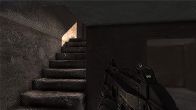

Early surface shader test of modular system

So far this all looked good on the drawing board! We proceeded to build our first playable space using this modular approach. Following are some screenshots:


Building on hills adds that fun complexity factor

Pretty cluttered view with weak path hinting, needs fixing!

This room would later become a meth lab

An early interior uncontaminated by props

We started integrating some high rise slum architecture

Hard lessons and Refinement

While our initial approach showed some promise, our modular construction system ended up being way more granular than we needed.

It was one of those sudden realizations that happens once all the pieces were on screen. Unfortunately, during normal game play the player moved through the environment so quickly that we had built way too much detail into the system.

It was not only too expensive to construct our worlds in terms of "per-minute of game play" cost, but the assets were too heavy in terms of performance when applied to larger level zones. This was primarily due to the mesh counts of all the pieces in the world.

Part of the solution was to find a way to slow down the player. But more importantly our system needed an overhaul. We would need to stop thinking of tiles as building sub-components or parts, and start thinking of them as entire buildings! 

In addition to the above, we hadn't captured the essence of the Art Tests in this first level incarnation. Quite simply we had to get better at executing visually and systematically if we wanted any chance at building a full AAA game.

What's coming next:

Coming up in Part 3, I will detail how we modified our system approach, and scaled up again to hit both our visual and performance targets. 


Sunday, August 19, 2012

Designing Environments That Feel Right - Part 1: Reference & Concept

Screenshot from an early FEAR 3 prototype build
As an art director, I've had to work on or oversee pretty much all categories of game art. But the one area I've always loved the most is Environment Design.

One could easily write a tome on the process of creating believable worlds in games. After years of working on sci-fi and fantasy franchises, the FEAR 3 project (Warner Bros. released June 2011) a.k.a. F3AR, represented the first time I had to deliver a near-future (almost present-day) world presentation.  

For those of you unfamiliar with the FEAR franchise, it's a survival horror game that combines paranormal elements (scary little girl, monsters) with psuedo-military futuristic combat. Accordingly the game takes place in dark, scary, moody locations often industrial or institutional in composition.


What was the goal for FEAR 3?

The visual goal as desired by the producers & publisher was "AAA photo-realistic action-horror game, like FEAR 1 but bigger better bolder etc. in a post-apocalyptic setting just after the timeline in FEAR 2". 

For me, the term photoreal describes a neutral position, devoid of stylistic intent. It merely represents an easy way to describe "believable" or "realistic" in game graphics. But the actual Art Style would be driven primarly by lighting, color, and motion within context of the game play. FEAR 1 established a nice palette with high contrast hard-edged lighting. We decided to start there.

One of the early directions for FEAR 3 was that it would take place primarily in South America, given that the protagonist in the first game had retreated there at the end. 

The directors liked the idea of Favelas as scary unpredictable environments, similar to those found in the slums of Rio De Jeinero or Sao Paulo in Brazil. The idea of a dark paranormal presence inhabiting a near-future (and exponentially bleaker) version of the modern world was compelling. 

Note: We thought we were being clever and original, not knowing that in the coming months both Modern Warfare 2 and the Hulk movie (and subsequently others) would be released featuring Favela locations.


First on the List was Visual Research

Whether you are recreating a real-world location, or creating a fictional place that needs to feel real, obtaining high quality reference material is absolutely necessary to ensure a credible execution. Physically or virtually, one needs to "live in those worlds" for a while in order to gain a grasp on building them convincingly.

These days, big-time game studios work more like film studios. If the goal is to feature a real-world location in the game, then location scouts investigate possible choices, returning with hundreds of photos as specified by the client. After the production team narrows down the choices, field teams are sent with photographers and videographers to "capture" the key location sites. 

This capture process focuses on everything that feels important; the architecture, lighting, surfaces, moods, ambient sounds, props & objects, landmarks... and most importantly the people on the team experience what it's like to be there, to feel the place in person. The team returns with a mountain of data, photos, video, and audio that become the basis of reference for the game's creative staff.

If a location visit isn't possible (e.g., going to Sao Paolo didn't work out) you instead build your reference database remotely. Fortunately, major cities are typically well documented on many levels.


Looking for the Right Images

In order to create a bleaker, scarier Favela environment, we started by identifying the key visual aspects which had the potential for an exciting, diverse experience. For us these aspects were:

- Unique organic architecture, consisting mostly of found materials
- Byzantine vertical topography that did not feel "on a grid"
- Threatening vibe of haphazard slums and dark mysterious areas
- Unique style of urban graffiti & visual language of Pixacao

Next, we performed extensive research on Favela-style locations and media, including but not limited to:

- Building a massive collection of over 1700 images of Favelas from university sites, photo blogs, and historical web archives 
- Study of published books including Shadow Cities, Favela, and Pixacao.
- Deep scrutiny of films featuring Favelas, including City of God, City of Men, Favela Rising, Carandiru, and Bus 174 to help capture the look & feel of life within these communities. Hundreds of key frames were captured as stills for reference.

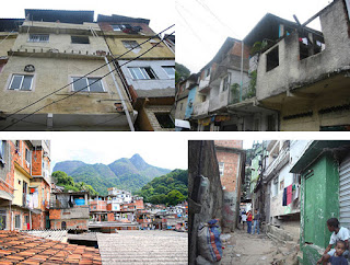
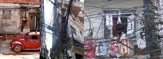
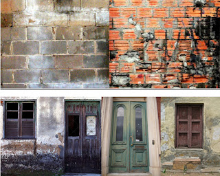
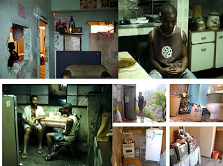
After gathering all this coarse data, we proceeded to do a narrower cull of images. Specifically we chose key images in the following categories (a small sampling follows):

Topography
Topography

Favela Architecture
Favela Architecture

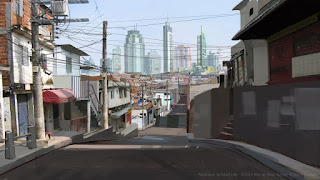
Street-Level Views
Street-Level Views
Degrading Civil Infrastructure
Architectural Surfaces I

Architectural Surfaces II
Transformed Building Facades

Stark Contrast between Poverty and Wealth
Favela Interiors
Favela Interiors
Unique Style of Graffiti and Pixacao Lettering

Identifying Useable Construction Elements

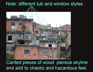
Next, we looked for specific architectural traits and styles in the reference images that we could incorporate into our world building. This was done by marking up key reference images with call-outs and descriptions highlighting the elements we wanted to utilize.

This process was driven by our lead concept artist Eliott Lilly, an exceptionally talented artist whose concept work also is shown farther into this article. 

Key Features Markup #1

Key Features Markup #2

Key Features Markup #3

Key Features Markup #4
Key Features Markup #1
Key Features Markup #5

An aspect of this process also worth mentioning is finding the emotional cues within the environment. These are human-imprint artifacts, things that represent the fictional culture, their ideas and beliefs. Graffiti, religious shrines, and personal props all become part of this visual language. We leverage them to help give life to an otherwise sparsely populated environment.


Bring on the Concept Art

The concept artists are core to the visual design process, contributing tone & mood pieces, color studies, paint-overs of in-game art to assist the 3d artists, visualization of key assets and props, as well as painting vistas and 2D background elements for the game.

When starting out on a new environment design process, typically we'd pick some cool potential spaces and just let the concept artists run with ideas within a few high-level constraints.

In attempting to look beyond the horror cliche of night settings, we liked the idea of a harsh, late afternoon sun-baked scenes with high contrast shadows where creepy things might lurk, heavy pollution, appearing deserted, with a decaying near-future South American urban atmosphere.

With all this in mind, a few key concept pieces are picked (from many) to serve as primary environment touchstones. These two pieces (Courtyard and Alley) created by Eliott Lilly gave us a solid target for our 3D Art Tests which would follow.

Favela Courtyard
Favela Courtyard

Favela Alley
Favela Alley

Color Study and Variations

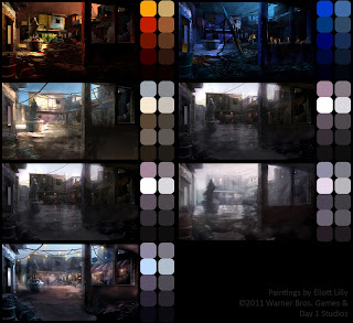
Ideally, color studies are done in concert with a story so that your world presentation is in sync with the emotional beats. Nobody would ever draw a storyboard without a script right? Yet at the time our story was still in flux, so in order to prepare for anything, Eliott did a range of color studies on given spaces to explore how they would feel at different times of day or changing weather conditions. From the color studies we can ultimately extract color palettes for the artists to use when building the 3D versions. 


Color Studies and Explorations on Favela Courtyard

In addition to the color & mood variations, we also explored finer iterations of lighting & surface treatments in a given space. Lighting would end up being a cornerstone of the project, and so a concept art track was dedicated to this.

Lighting Variants & Moods for Favela

There was also this idea of an alternate universe forming, something we called "world behind the walls". The idea was a parallel universe, similar to the hell from the movie Constantine, that co-existed with our normal world. Creatures from this alternate universe were breaking through into ours, and occasionally you (the player) would be able to see this world switch in & out while fighting these creatures.

Normal Street View Paint-Over

Alternate Hella-verse Street View Painting

Throughout pre-production, dozens of amazing concept images get created for a given environment (see more of these on Eliott's website). But that's just the beginning. We have to take that beautiful imagery and convert it into a systematic, modularly constructed game environment. 

What's Next?

In my next post I will cover moving into 3D, how we created the first in-game Art Tests for the Favela environment, and how we scaled up from there into modular construction of much larger worlds!

Be sure to check out more of the Art of Eliott Lilly:

Eliott Lilly Blog
Eliott Lilly Porfolio


Tuesday, August 14, 2012

The key components to succesful video game art: Team, Process, and Vision.

In the coming weeks I am going to be posting a number of things on art process. But I think it's important to take a step back momentarily, and contextualize all this within the framework of the big picture.

This piece is written from an art director's perspective, with larger teams in mind. But I believe much of it is applicable to smaller projects.

An important part of Art Process is process management. Sure, an art director needs to be able to make art, but it's equally important to create the conditions for successful art production.

There are three critical aspects that go into making the art in a video game successful. 


I. A strong, motivated team
II. A proven process for making high quality art content
III. A compelling vision for what the game will ultimately look like

In the end, it all boils down to this list.

Successful game art captures the emotion required to support the narrative, provides a suitable level of fidelity in support of both the visual style & game design, and executes at the edge of available performance budgets on the target hardware.

In plain English... it feels good, looks good, and runs good.

I. Strong, Motivated Team
"Simple is Good" - Jim Henson

Building an effective, collaborative environment for the creative process to succeed is one of the most important goals for an Art Director. It may sound obvious, but the key to this goal is to provide a structure where people know their roles & responsibilities, and have the authority to perform them.

Sooo simple, right? Yet ultimately, the lack of this kind of structure is the source of most frustration individuals feel on long, stressful projects.

Structure is a core system; people crave it, and the leadership implied within. The skeleton of structure is communication. Once roles are defined, sensible and track-able goals should be set in a collaborative process. Each team member leaves with the knowledge of what they need to do, and how to resolve questions or concerns.

What can break structure? Project changes. The liquid medium of games assures some degree of chaos. The weapon against chaos of change is real, honest & diligent pre-production. If performed correctly, project pre-production will provide the data to validate most arguments against random ideas or unnecessary detours.

One cannot completely forgo change in the game development process, but a well-developed structure will absorb and focus change positively.

A good Art Director will provide the backbone of team structure, and will test the conviction of those who wish to experiment with or derail proven process.

Back when I was at Microsoft, I once composed a graphic describing the qualities of an effective A/D. Some of the terminology is specific to that company, but most should be self-evident.

Art Director Sphere of Influence
Starts with Art Staff and radiates outward.

II. A Proven Process


"Not a half dozen men have ever been able to keep the whole equation of pictures in their heads." - F.Scott Fitzgerald (1940)


Process is one of those subtly powerful words. Canning marmalade is a process. But canning incredibly delicious marmalade inexpensively is a refined process that has value to anyone in the jam & jelly industries.

Art process for games can be defined as a "combining mature art production methods known to achieve optimal visual results, with tools & technology that have similarly been refined through the experience and knowledge of users."

Art process is documented, transparent to the team, shared across projects, and passed on as staff migrates. It represents the technical culture, the accumulated value of thousands of trials and lessons learned within a studio.

To ignore it, to render it disposable, to not value the people who contribute to it, or to not provide sufficient infrastructure for process documentation to flourish is to squander resources foolishly.

 
III. The Vision For The Game

"Looking up gives light, although at first it makes you dizzy." - Mevlana Rumi


Vision is one of those loaded words that often comes up during game projects. What's the vision? Who's the vision holder? Does everyone understand the vision?

Artistic vision takes many forms. Rarely does one person just stroll in one day with "the vision", spilling it out on the conference table as artists eagerly lap it up. Vision starts with words, and those words are broken down into images. It's a process of separating the wheat from the chaff, refining and forming a collective understanding.

The most effective way to develop the Art Vision for a game is during a thorough pre-production period. This includes a collaboration with the designers & programmers to ensure the right art style works with the design & technical features. The end product from pre-pro is a collective expression of how the game could look & play with a proper production run.

The risk of not allowing this early vetting & diligent testing of ideas is lost time. The time you will spend in production trying to solve for unforeseen design issues, or defending late choices while the team waits to commit and move forward. The time spent creating concept art for assets that should have already been in production. You will always pay for pre-production somewhere along the way, why not do it first when it's efficient and schedule-able?

The role of the Art Director is to champion the vision, to gain buy-in from everyone on the team first-hand throughout the project, in a very visible, credible way.

Sunday, August 12, 2012

Top 10 Things you DIDN'T know about creating the artwork for Avatar Laser Wars 2

This week I shipped my first indie game created in cooperation with Digital DNA Games, it's called "Avatar Laser Wars 2" and is available on XBox Live Indie Games channel.

Here are some notes on the art production which I was responsible for. This is primarily for art geeks, but also for anyone interested in how a game like this comes together.

So here goes, the Top 10 Things you DIDN'T know about creating the artwork for Avatar Laser Wars 2:

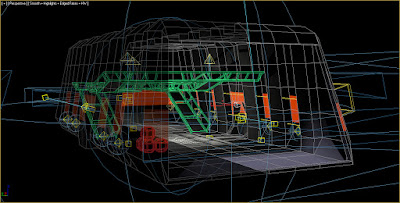
#1. The space station environment uses almost no hand-painted texture maps. instead opting for pure lighting baked into textures using Mental Ray's Global Illumination and Final Gather. While this was my goal for the aesthetic, this approach also let us revise and iterate more space quickly since the texturing became procedural.

Hangar Lighting Rig
The lighting rig for the Hangar section, one half was baked and then mirrored.

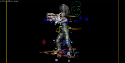
#2.  To create the character animation I had to decode and master the 400+ node skeleton that is the Microsoft Avatar. The majority of the animation was hand-keyed using just the IK controls, except the fingers which are FK. There is one set of animations to service both 1st and 3rd person views.

The Microsoft Avatar IK/FK Rig
The Avatar Rig... sooo many nodes.

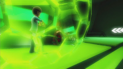
#3. The kickass laser effects were created by Tom at Digital DNA (DDNA), I only painted the texture map. DDNA also created the full-screen effects; hdr-like bloom, screen distortion, damage fx, flash grenade blowout, etc. as well as the bubble shield and cloak effect.

A procedural bubble shield with distortion
Procedural bubble shield with distortion modulation.

(comment: Every artist should be so lucky to recieve this kind of amazing support. Several of these features are XNA firsts!)

#4. Along those lines, DDNA also wrote a brilliant lighting system that dynamically lights the world from the weapon effects, and also the Avatar & gun as if from the baked environment lighting. The latter just required placing static light nodes hooked to lights that approximated my baked solution. Best of both worlds!


Lighting effects while havoc is being wreaked
A grenade cooks off, and dynamic lighting ensues.

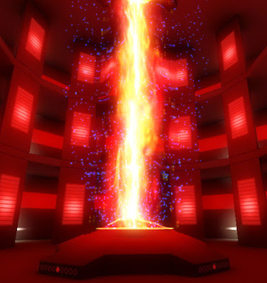
#5. I created the Reactor Core effect with scrolling textures, DDNA's screen distortion, and a hilariously dense particle system. Staring at it for too long has been known to cause hallucinations.

The core in the Reactor Room
A blazing power core, OSHA would not be pleased...

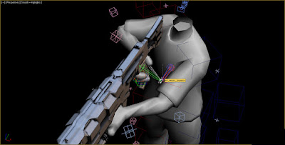
#6.  The weapons were challenging to model, the guns all needed to share grips in order to keep the number of animations low. It was tough getting the gun alignments just right for iron sights, mostly due to the Avatar's peculiar node transform for the prop attachment. On the plus side, DDNA wrote an awesome shader that let us add specular, self-illumination, and normal maps to the guns.

Gun & hand alignment was tricky
Look at that lonely prop node so far from the comfort of the right hand.

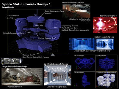
#7. We re-worked the entire level three times in order to find the best balance of layout, player flow, sight lines, weapon ranges, and performance. Building everything in modular sections helped, and a good amount of time was spent on collison to ensure smooth gameplay. What we ended up with was a fair distance from my initial concept, but still retained the essence of it.

Original design for space station
The first concept and style sheet for the Space Station.

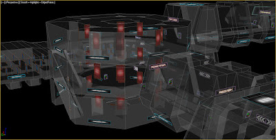
#8. There is an additive-blended layer in the environment that contains numerous elements like the light glows, signage, control panels, animated textures (scroll-ies and blink-ies), and Env light fixtures. I hand placed hundreds of these elements to add detail to the level.

Additive layers of detail
Many, many mouse clicks were required to add all the bright glowy bits.

#9. The user interface (on my end) was the frames & fonts in the menu shell, as well as the HUD icons. The Digital DNA team wired it all together, and integrated realtime Avatars in the shell which animate and update based on weapon choices. 

The UI for weapon equipment
The UI for Weapon Equipment concept

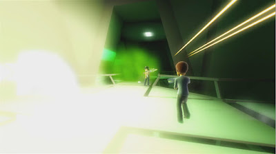
#10. The slow-mo intro sequence you see in the Start Screen was designed by DDNA. The sequence spawns random Avatars so it's a little different every time you see it. I created the action poses and the camera fly-through path.

Intro sequence plays behind the menus
A dreamy slow-mo sequence plays behind the initial game menus

This project was a bit more work than I thought it would be haha (!), but I'm very happy with the outcome. Working with Digital DNA and their technology was great, I learned a ton and had a lot of fun. It took roughly 4 months of solid work on my end, in between life and everything else.

More on Avatar Laser Wars 2:

the obligatory first blog post

I've resisted writing a public blog up until this point, mainly because it's work to write cleverly and keep interesting content flowing. During my years as a corporate art-bot, I put together hundreds of internal wiki pages on art process, as well as giving lectures and of course interfacing directly with artists.

Now after nearly a year working in the indie realm, I feel it's a good time to share my new experiences, as well as reflect on lessons learned in the past. So henceforth I submit to the world my professional journal.

The first major post coming up will cover my role on Avatar Laser Wars 2, an indie game just released on XBox Live Indie Games channel. I hope you get a chance to check it out!