 |
| Screenshot from an early FEAR 3 prototype build |
One could easily write a tome on the process of creating believable worlds in games. After years of working on sci-fi and fantasy franchises, the FEAR 3 project (Warner Bros. released June 2011) a.k.a. F3AR, represented the first time I had to deliver a near-future (almost present-day) world presentation.
For those of you unfamiliar with the FEAR franchise, it's a survival horror game that combines paranormal elements (scary little girl, monsters) with psuedo-military futuristic combat. Accordingly the game takes place in dark, scary, moody locations often industrial or institutional in composition.
What was the goal for FEAR 3?
The visual goal as desired by the producers & publisher was "AAA photo-realistic action-horror game, like FEAR 1 but bigger better bolder etc. in a post-apocalyptic setting just after the timeline in FEAR 2".
For me, the term photoreal describes a neutral position, devoid of stylistic intent. It merely represents an easy way to describe "believable" or "realistic" in game graphics. But the actual Art Style would be driven primarly by lighting, color, and motion within context of the game play. FEAR 1 established a nice palette with high contrast hard-edged lighting. We decided to start there.
One of the early directions for FEAR 3 was that it would take place primarily in South America, given that the protagonist in the first game had retreated there at the end.
The directors liked the idea of Favelas as scary unpredictable environments, similar to those found in the slums of Rio De Jeinero or Sao Paulo in Brazil. The idea of a dark paranormal presence inhabiting a near-future (and exponentially bleaker) version of the modern world was compelling.
Note: We thought we were being clever and original, not knowing that in the coming months both Modern Warfare 2 and the Hulk movie (and subsequently others) would be released featuring Favela locations.
First on the List was Visual Research
Whether you are recreating a real-world location, or creating a fictional place that needs to feel real, obtaining high quality reference material is absolutely necessary to ensure a credible execution. Physically or virtually, one needs to "live in those worlds" for a while in order to gain a grasp on building them convincingly.
These days, big-time game studios work more like film studios. If the goal is to feature a real-world location in the game, then location scouts investigate possible choices, returning with hundreds of photos as specified by the client. After the production team narrows down the choices, field teams are sent with photographers and videographers to "capture" the key location sites.
This capture process focuses on everything that feels important; the architecture, lighting, surfaces, moods, ambient sounds, props & objects, landmarks... and most importantly the people on the team experience what it's like to be there, to feel the place in person. The team returns with a mountain of data, photos, video, and audio that become the basis of reference for the game's creative staff.
If a location visit isn't possible (e.g., going to Sao Paolo didn't work out) you instead build your reference database remotely. Fortunately, major cities are typically well documented on many levels.
Looking for the Right Images
In order to create a bleaker, scarier Favela environment, we started by identifying the key visual aspects which had the potential for an exciting, diverse experience. For us these aspects were:
- Unique organic architecture, consisting mostly of found materials
- Byzantine vertical topography that did not feel "on a grid"
- Threatening vibe of haphazard slums and dark mysterious areas
- Unique style of urban graffiti & visual language of Pixacao
Next, we performed extensive research on Favela-style locations and media, including but not limited to:
- Building a massive collection of over 1700 images of Favelas from university sites, photo blogs, and historical web archives
- Study of published books including Shadow Cities, Favela, and Pixacao.
- Deep scrutiny of films featuring Favelas, including City of God, City of Men, Favela Rising, Carandiru, and Bus 174 to help capture the look & feel of life within these communities. Hundreds of key frames were captured as stills for reference.
After gathering all this coarse data, we proceeded to do a narrower cull of images. Specifically we chose key images in the following categories (a small sampling follows):
 |
| Topography |
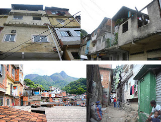 |
| Favela Architecture |
 |
| Street-Level Views |
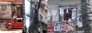 |
| Degrading Civil Infrastructure |
 |
| Architectural Surfaces I |
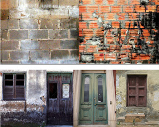 |
| Architectural Surfaces II |
 |
| Transformed Building Facades |
 |
| Stark Contrast between Poverty and Wealth |
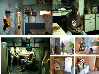 |
| Favela Interiors |
 |
| Unique Style of Graffiti and Pixacao Lettering |
Identifying Useable Construction Elements
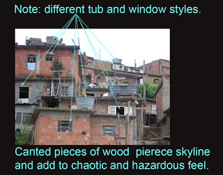
Next, we looked for specific architectural traits and styles in the reference images that we could incorporate into our world building. This was done by marking up key reference images with call-outs and descriptions highlighting the elements we wanted to utilize.
Next, we looked for specific architectural traits and styles in the reference images that we could incorporate into our world building. This was done by marking up key reference images with call-outs and descriptions highlighting the elements we wanted to utilize.
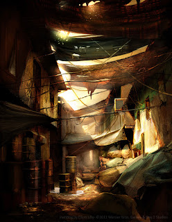
This process was driven by our lead concept artist Eliott Lilly, an exceptionally talented artist whose concept work also is shown farther into this article.
An aspect of this process also worth mentioning is finding the emotional cues within the environment. These are human-imprint artifacts, things that represent the fictional culture, their ideas and beliefs. Graffiti, religious shrines, and personal props all become part of this visual language. We leverage them to help give life to an otherwise sparsely populated environment.
Bring on the Concept Art
The concept artists are core to the visual design process, contributing tone & mood pieces, color studies, paint-overs of in-game art to assist the 3d artists, visualization of key assets and props, as well as painting vistas and 2D background elements for the game.
When starting out on a new environment design process, typically we'd pick some cool potential spaces and just let the concept artists run with ideas within a few high-level constraints.
In attempting to look beyond the horror cliche of night settings, we liked the idea of a harsh, late afternoon sun-baked scenes with high contrast shadows where creepy things might lurk, heavy pollution, appearing deserted, with a decaying near-future South American urban atmosphere.
Ideally, color studies are done in concert with a story so that your world presentation is in sync with the emotional beats. Nobody would ever draw a storyboard without a script right? Yet at the time our story was still in flux, so in order to prepare for anything, Eliott did a range of color studies on given spaces to explore how they would feel at different times of day or changing weather conditions. From the color studies we can ultimately extract color palettes for the artists to use when building the 3D versions.
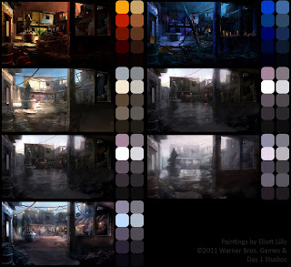 |
| Color Studies and Explorations on Favela Courtyard |
In addition to the color & mood variations, we also explored finer iterations of lighting & surface treatments in a given space. Lighting would end up being a cornerstone of the project, and so a concept art track was dedicated to this.
There was also this idea of an alternate universe forming, something we called "world behind the walls". The idea was a parallel universe, similar to the hell from the movie Constantine, that co-existed with our normal world. Creatures from this alternate universe were breaking through into ours, and occasionally you (the player) would be able to see this world switch in & out while fighting these creatures.
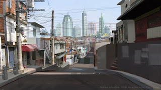
Throughout pre-production, dozens of amazing concept images get created for a given environment (see more of these on Eliott's website). But that's just the beginning. We have to take that beautiful imagery and convert it into a systematic, modularly constructed game environment.
What's Next?
In my next post I will cover moving into 3D, how we created the first in-game Art Tests for the Favela environment, and how we scaled up from there into modular construction of much larger worlds!
Be sure to check out more of the Art of Eliott Lilly:
Eliott Lilly Blog
Eliott Lilly Porfolio
In my next post I will cover moving into 3D, how we created the first in-game Art Tests for the Favela environment, and how we scaled up from there into modular construction of much larger worlds!
Be sure to check out more of the Art of Eliott Lilly:
Eliott Lilly Blog
Eliott Lilly Porfolio






No comments:
Post a Comment